Category Archives: Teaching data literacy

Strategies for building students’ data literacy (in the context of learning disciplinary content).

Building Blocks for Data Literacy

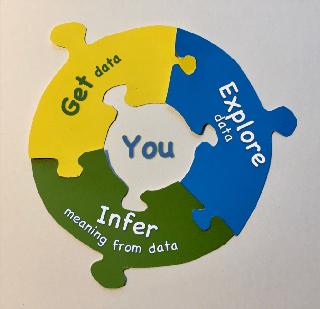
Are you wondering what kinds of data skills and ideas your students could be developing in your classroom?

The value of students developing data literacy is becoming recognized across disciplines, from STEM subjects to social sciences and even in language arts, with emphasis on communicating ideas and developing arguments. Despite the enthusiasm, deciding how to build data literacy as part of classroom instruction challenges many educators.

Continue reading

Curiosity, Questions, and Meta-Questions

Asking questions is widely perceived as the first step in science. It’s listed as the first NGSS Science and Engineering Practice, and it is, indeed, often how a scientific investigation formally begins. Yet something does happen before a question takes shape. Questioning also continues to happen after an initial question is posed.

Here are a few thoughts in hopes to breathe life into the practice of asking questions throughout the process of gathering, exploring, and making sense of data.

(Photo by MI PHAM on Unsplash)

Continue reading

Reflections: Teaching about Independent and Dependent Variables

Identifying independent and dependent variables only matters when the two variables concerned have a causal relationship — a change in one variable causes the other to change, but not the other way around. For example, more turns of a wind-up band causes a model cart to travel farther. The inverse relationship, the idea that the distance a cart travels determines the number of wind-up turns, makes no sense because the wind-up turns already happened. The relationship is causal. Other relationships aren’t causal at all, for example arm span and height. Neither variable is independent or dependent, but they are correlated.

When do students need to recognize the difference between independent and dependent variables? Why is distinguishing between independent and dependent variables important?

Continue reading

Line plot and dot plot: What’s the difference?

They are the same thing!

Line plots and dot plots show how data values are distributed along a number line:

For some reason, the Common Core Math Standards call them line plots in the standards for grades 2 through 5, and dot plots in grade 6 onward. Don’t confuse line plot with a line graph, which has two numeric values on X and Y axes, with the points connected by lines.

Continue reading

Organizing Student Data for Computer Visualization

public domain photo by Ken Thomas

Over the past few years, web-based tools like Tuva and CODAP have made it easy for students to explore data in intuitive ways that keep them focused on what the data have to say rather than on spreadsheet mechanics.  Many teachers use these tools with curated, fully-prepared datasets. But these tools can also be used to explore data that the students have collected themselves. However, we have found that many teachers encounter difficulty in organizing student data to work well with Tuva or CODAP. In this post, we use a hypothetical student study of birds on feeders to illustrate the issue and how to address it.  Continue reading

Why bother graphing by hand?

Sometimes we forget that a pencil is technology, an idea easily lost in this age of electronics constantly at our fingertips, and computers in every classroom. But a good pencil or pen, with its tactile connection to our brain, can be a useful tool for learning to informally assemble information from small datasets, picture relationships, and glean ideas without the constraints of pre-programmed graphing applications.

Graphing by hand is a powerful strategy for learning, and for teaching. Students gain several skills when they first learn to draw a graph by hand.

Continue reading

Link graph choice to a question

You many be familiar with the Graph Choice Chart, a classroom tool we developed when we realized that many students did not have a logical basis for deciding how to graph data when given a choice. The Graph Choice Chart provides a decision tree that leads students to a variety of graph types that support the kind of question they are investigating. It provides one more way for students to be decisionmakers in analysis, and “own” their outcomes. Continue reading

You have data, now what?

Students can be great at collecting data. But once they have a table of data, many are not sure how to proceed. As teachers, we often toss students data in different forms to analyze and interpret: pre-made graphs, data collected during labs, small tables of data to graph by hand, or tables of data to graph in Excel or Google sheets. We hope they will “analyze” the data and come up with meaningful insights and explanations of the data as evidence. But we are often discouraged by what students hand in. What does one actually do when analyzing data? More precisely, what are some of the decisions that students can wrestle with and come to own as they turn a table of data into evidence and useful information?

Continue reading