
You many be familiar with the Graph Choice Chart, a classroom tool we developed when we realized that many students did not have a logical basis for deciding how to graph data when given a choice. The Graph Choice Chart provides a decision tree that leads students to a variety of graph types that support the kind of question they are investigating. It provides one more way for students to be decisionmakers in analysis, and “own” their outcomes.
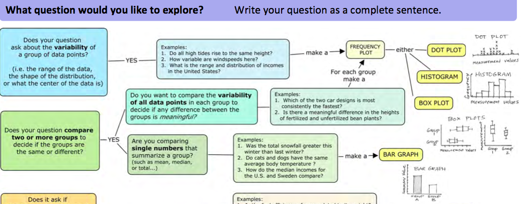
For the Graph Choice Chart to work, students should start with a clear question, because the choice of graph depends on what you want to find out. Students can easily become stuck graphing data when they don’t have a clear question in front of them. It helps if they write the question down. When speaking informally, we all tend to frame questions imprecisely, for example, “I want to know about wind speeds“. (Not a question). Guide students to be more precise. “What are the wind speeds of hurricanes?” or “How do wind speeds of hurricanes compare with wind speeds for tropical storms and depressions?“, or, “What is the relationship between wind speed and barometric pressure?” Each of these questions hints at what kind of graph will work best, and which variables are needed.
It also helps in the beginning if students map their questions to one of the types on the left side of the Graph Choice Chart. The four question types can capture many of the kinds of questions students are likely to investigate, although some rephrasing might be needed. For example, students often initially pose “why” or “what causes” kinds of questions. The question “What causes hurricanes?” would be a frustrating question for beginning students to find evidence to answer. More precise questions such as “How long do hurricanes last?“, or “Where do hurricanes form?” are both easily answered with a table of data such as this one, about tropical Atlantic storms.
Some of the vocabulary used in the Graph Choice Chart might be unfamiliar to some students. Here is a reference sheet with a few tips for using the Graph Choice Chart including brief explanations of some of the terms it uses.
Scaffolding students to analyze data with a clear question in mind, and supporting them to make reasoned choices in how best to represent the data, not only keep a sense of purpose at the center of their analysis, but also helps students own and justify their particular approach and their findings.

Thank you ffor sharing