
Bar graphs and histograms look similar, and people often use the terms interchangeably, but they are not the same kind of graph.
Bar graphs (also called bar charts) are one of the first kinds of graphs young students learn to make. They are useful to show total values for a group, such as counts, averages, or total amounts of something (such as total monthly rainfall). On the other hand, histograms are a kind of frequency plot. They are introduced in the Common Core Math Standards in sixth grade, when students begin to think about properties of groups and variability.
Bar graph
Young elementary students (Grades 2-4) learn to use bar graphs to show whole counts of things in different categories. Students might create bar charts to show counts of classmates who commute to school using different modes of transportation, numbers of students who have different favorite colors, or to tally the number of games won or lost by sports teams.
In bar graphs, one axis (often X) has two or more categorical groups, the other (often Y) has a number scale for counts of things. Below are two bar charts showing the numbers of male and female crabs caught by a 7th grade class in 2010.

The bar graphs above answer the question: How many green crabs of each sex were caught? (Note: this is not a statistical question, as it has a factual answer that leaves no room for doubt or discussion.)
In grades 4 and 5, students learn to use and convert units of measurement, and may create bar graphs of measurements other than numbers of things, such as the carapace widths of the crabs they caught. To use a bar graph to show the widths of male and female crabs, students could either show a single bar for each crab they measured:
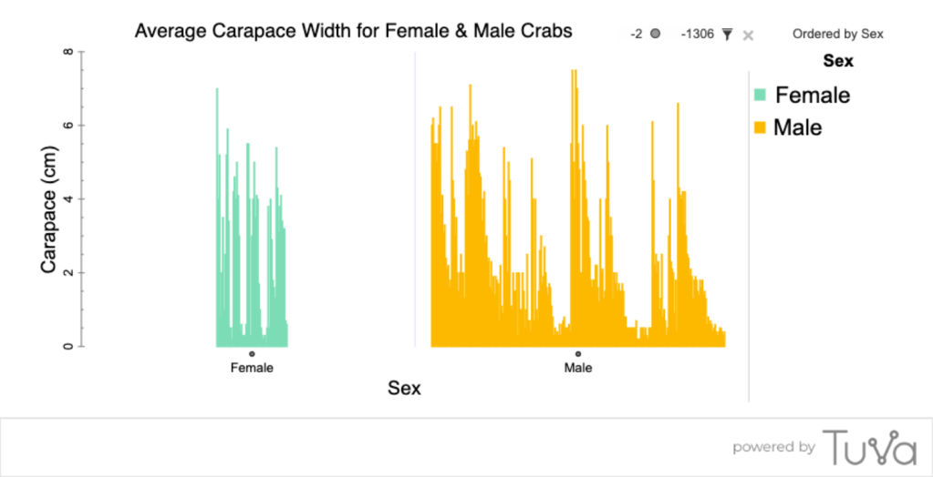
or they could summarize each group with one number, such as an average.

The two bar graphs above are intended to answer the question: How wide were carapaces of the male and female crabs we caught? Note that while both graphs are made correctly, neither graph makes it easy to visually compare the two groups. The first graph has case-specific detail given in an arbitrary order, and the second graph gives only the average for each group, so we can’t see the distribution (i.e. how clumped or spread out the values are) in each group.
Histogram
Histograms show something quite different. Histograms, like dot plots and box plots, show how often the different measurements within a group occurred. The following histogram shows the distribution of carapace widths for over 1,600 crabs caught and measured by the 7th graders over four years. Each ‘bar’ represents how many crabs fell into each “size bin”. The bins are Carapace widths set at 0.5 cm intervals, so 0-0.49 cm, 0.50-0.99 cm, 1.0-1.49 cm, and so forth. The number above each bin indicates how many crabs were in that size range.
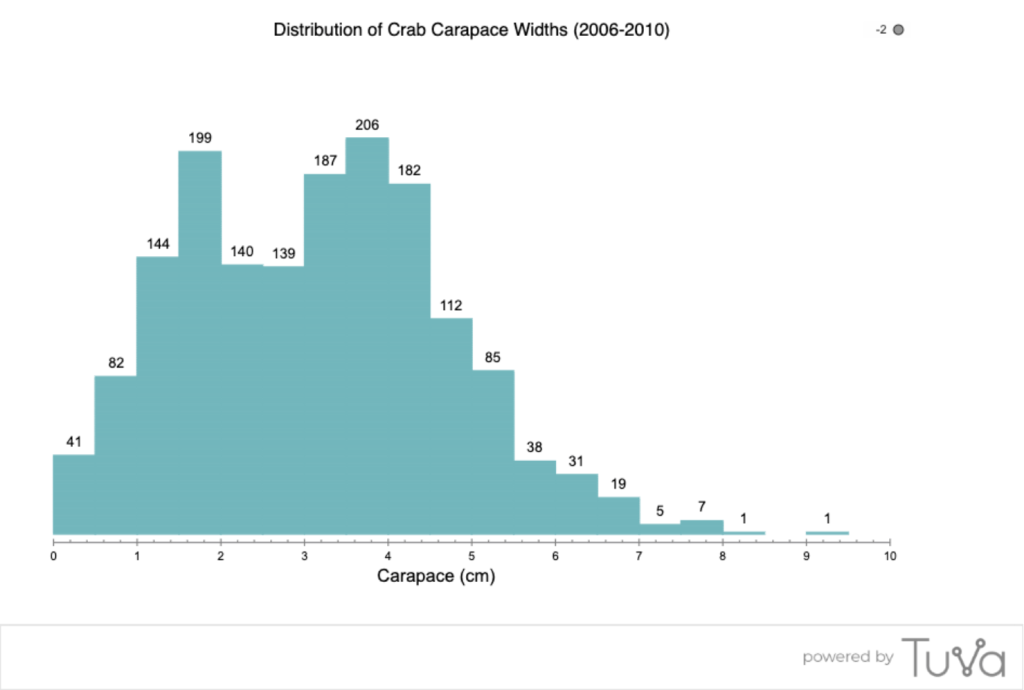
Casually, it looks like the main bunch of crabs fall between 1.5 and 4 cm, with some bigger and some smaller crabs. We can separate them into males and females for an easy visual comparison of the sexes: Do males and females tend to be the same size? (Note that this is a statistical question because it can be answered reasonably in several ways, and there is room for discussion about it.)
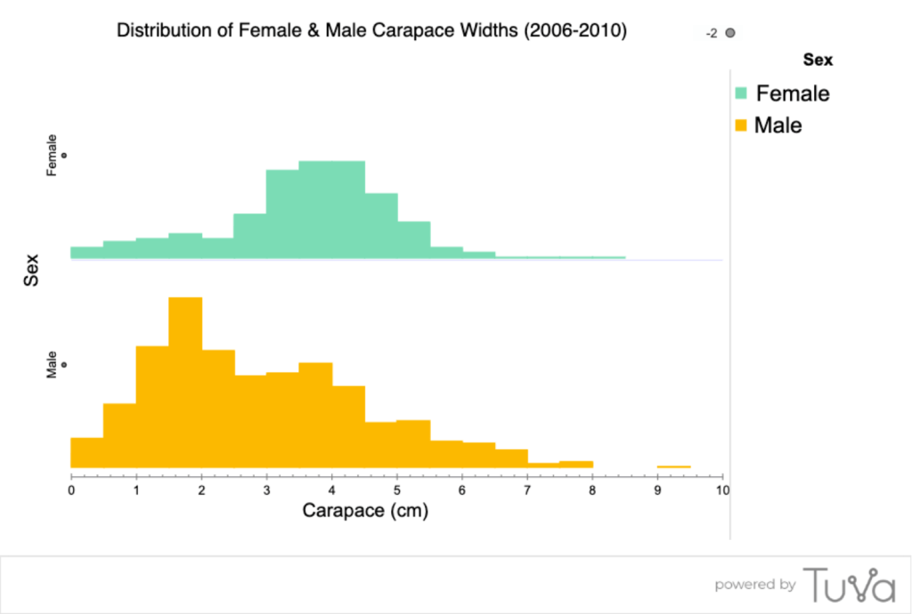
From the histograms above, it looks like females tend to be slightly larger than males — the main clump of females is shifted slightly higher than the main clump of males. But there are certainly many males that are larger than many females, and the largest crab measured was male. The histograms let us talk about properties of each distribution as a group, not about individual crabs.
Summary
Histograms are useful to show how measurements are distributed along a scale. They are especially useful when there is a large number of cases, and when the measures span a wide range that can be grouped into bins (sub-ranges, such as 0-0.49, 0.5-0.99, 1.0-1.49, etc.).
The base of each ‘bar’ in a histogram is positioned along the numeric scale. The order of the ‘bars’ in a histogram can’t be changed — it is determined by how many cases fall into each bin. The ‘bars’ touch each other, because the bins they represent are on a continuous scale. The width of the bars is defined by the range included in each bin.
Bar graphs are useful to show a discrete sum or amount. The base of the bar is positioned along a categorical scale, with each bar height representing a summary value for a categorical group (or the value for a single case). The bars don’t usually touch each other because they represent discrete values for discrete groups (or cases). Thus, the bars (categories) can be shown in any order without changing the meaning of the data. The height of the bar relates to a value on the numeric scale — the value for that group (or case).
Deciding which type of graph is best to use in a given situation depends on what kind of evidence that is needed — to show a tally or a total amount, or to compare the distributions of groups of measurements. Encourage students to recognize how bar charts and histograms are different and to be deliberate in deciding when to use which one.

Hi Friends, Please add Chuck Neely, my new colleague, to this mailing list. His email is —. Wednesdays are data literacy days in our crazy Covid schedule. I want to offer students rich work in data literacy throughout their course. We will begin with the data literacy assessment that Barbara Harrity turned into a Google Quiz. I hope to lean on you this year and I will do anything for you. Ed
Ed Lindsey, Science Teacher Old Town High School 203 Stillwater Avenue Old Town, Maine 04468 Phone: (207) 827-3910 x2406 ________________________________